For online shops
Find out why visitors browse your shop but don't buy
Find what's stopping shoppers adding to basket and finishing checkout: unclear delivery costs, hidden add-to-basket buttons, weak product images, forced account creation and more, all checked against e-commerce research.
A real audit of a site like yours
Fernhollow Home: score 61
A demo online shop we built and ran through AgoraScan. 42 issues found across 4 pages. Open the full report
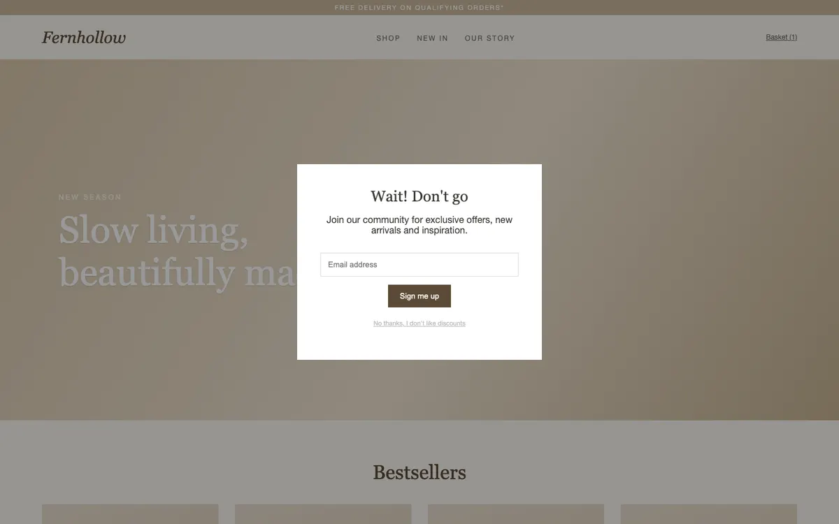
A sign-up box covers your page as soon as it opens
Fix: Remove the box on arrival. Show it later, or offer a small sign-up form near the bottom of the page.
Shoppers browse but don't buy
We check product pages for the essentials: a prominent add to basket, clear options, enough images, reviews and delivery information near the price.
Baskets get abandoned
Surprise delivery costs and forced account creation are two of the biggest causes. We check for both, and for a clear total.
Mobile shoppers struggle
Every page is checked at phone size: tap targets, filters, sticky bars and whether the important bits fit on screen.
What we check
102 checks for this kind of site
Every audit runs the measured accessibility, speed and mobile checks, plus the expert-review rules that apply to your pages. These are the ones written specifically for online shops:
Questions
- Can it audit my checkout?
- It audits the pages it can reach without an account or a basket, including product, listing and basket pages where they're public. Checking a full checkout flow needs interaction, which is coming next.
- Does it work with Shopify, WooCommerce and others?
- Yes. We look at the pages your shoppers see, so the platform doesn't matter.
- Which pages should I audit?
- Your homepage, a best-selling product page, a category page and the basket. A full audit covers up to five pages.
Check your own site
Get a score for your website and your top problems, with screenshots, in about 2 minutes. Free, no card needed.